Creative Portfolio of Peter Waldock
Branding, App UI & Marketing
Kontainers Branding
Values, beliefs, and artwork created to reflect the spirit of the company.
Website
Selling Technology to an Internet Weary Generation.
The aesthetics and user experience needed to speak bleeding edge tech in an approachable way.
Kontainers - Web App - V1
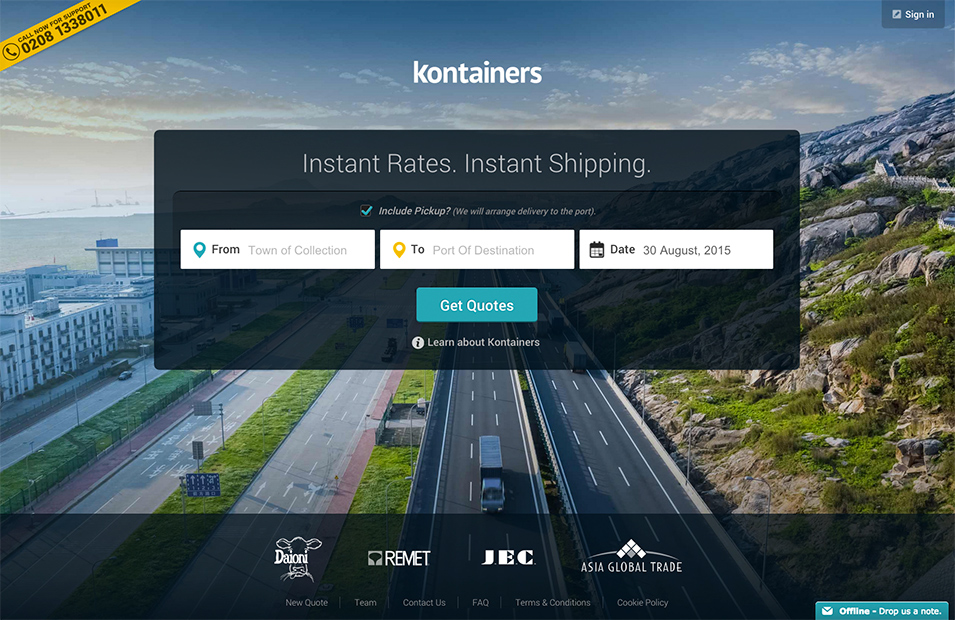
V1 Design - Homepage
The first version of the app homepage aimed at making a dry booking form simpler and more aesthetically pleasing.
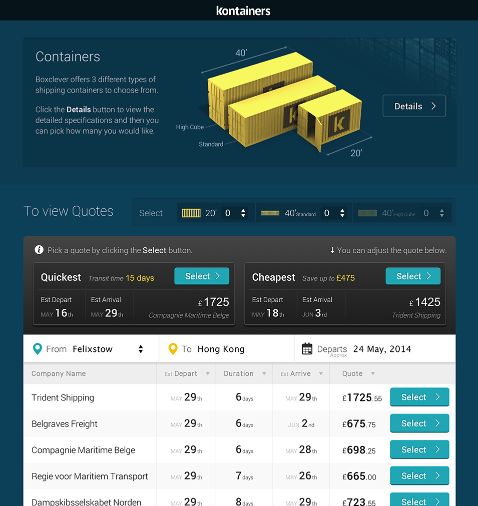
V1 Design - Quotes page
Whilst the user experience was to a high standard by use of an attractive UI, progressive disclosure and delightful animations the second version took the tennets to the next level.
Kontainers - Web App - V2
Freight Shipping Made Simple
Boiling the user journey down to it's simplest form and reconstructing it with engaging visuals resulted in a brutaly simple to use wizard style flow. Version 2 was aimed squarely at our less technically savy target users but still enjoyable to use by all.
Digital Marketing
Outbound
I have setup many email campaigns at containers using different tools to craft and manage them. Beginning with Mailchimp I progressed to Hubspot with it's comprehensive suite of marketing tools.
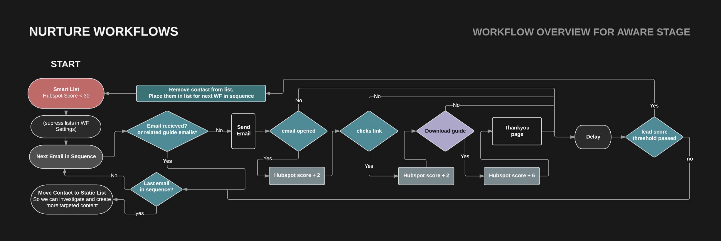
Lead Nurturing
Email marketing is an art requiring a great deal of time investment. With so many plates spinning I needed to create a robust automated workflow to manage the email drip process based on buyer journey stages.
HTML Email Design and Build
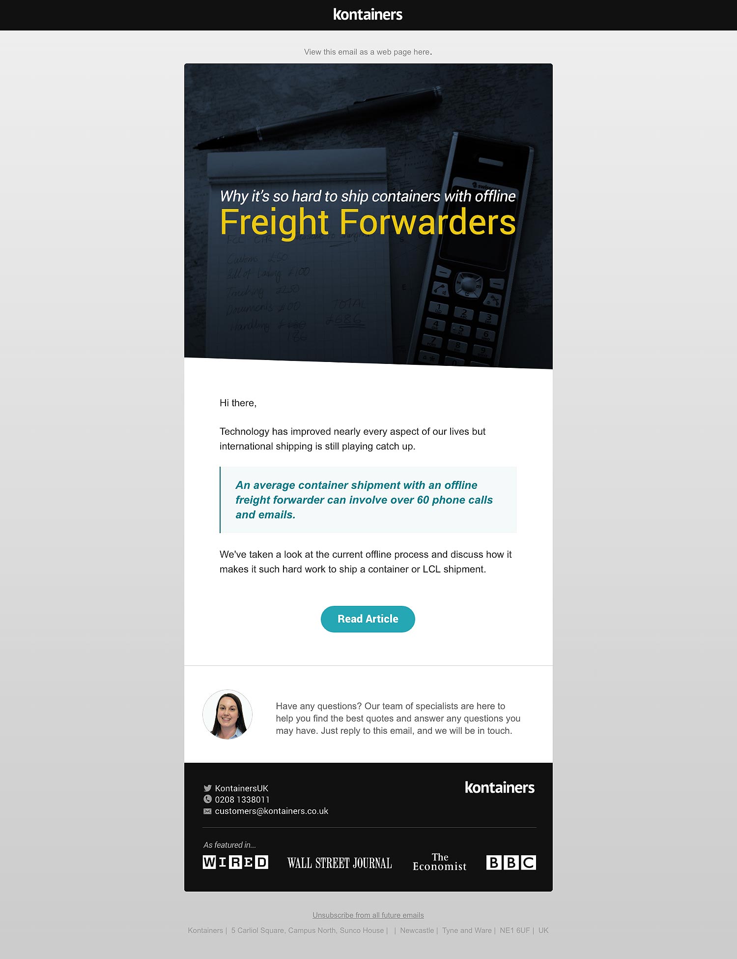
Drip Campaign Emails
Sample of emails designed to Leverage the blog posts, infographics and guide download offerings targeted at the contacts at the aware stage of the buyer journey.
Kontainers - Content Offers
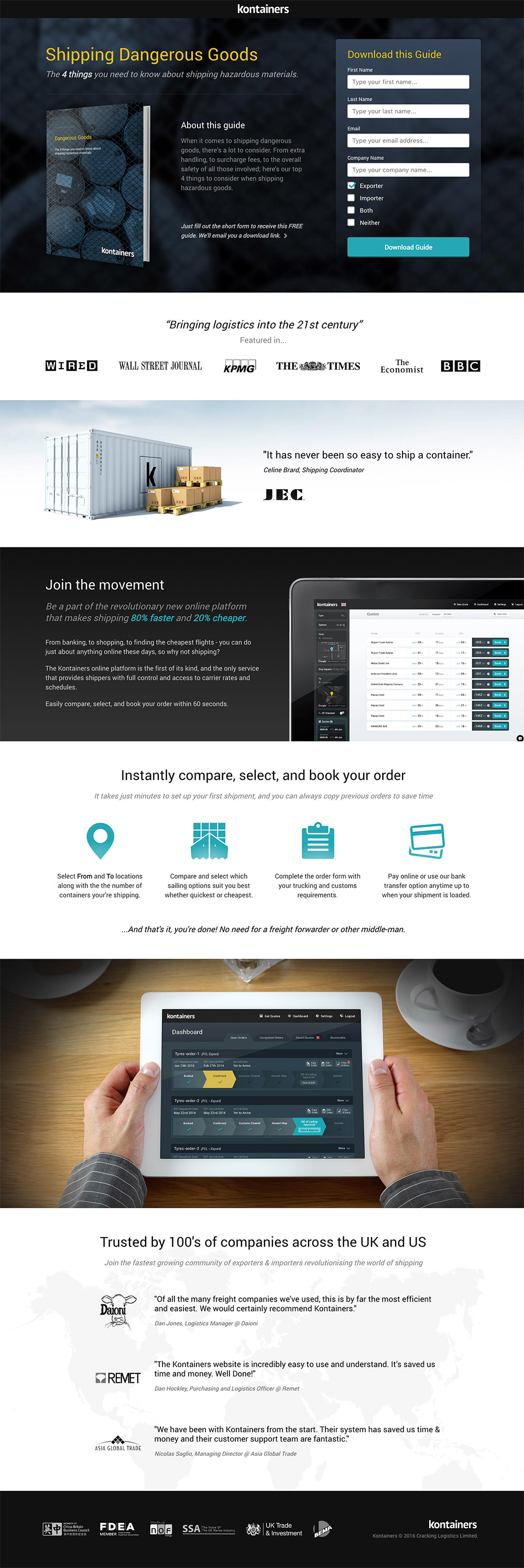
Landing pages
All content offerings reside on a landing page designed to generate and nurture leads via SEO and email campaigns.
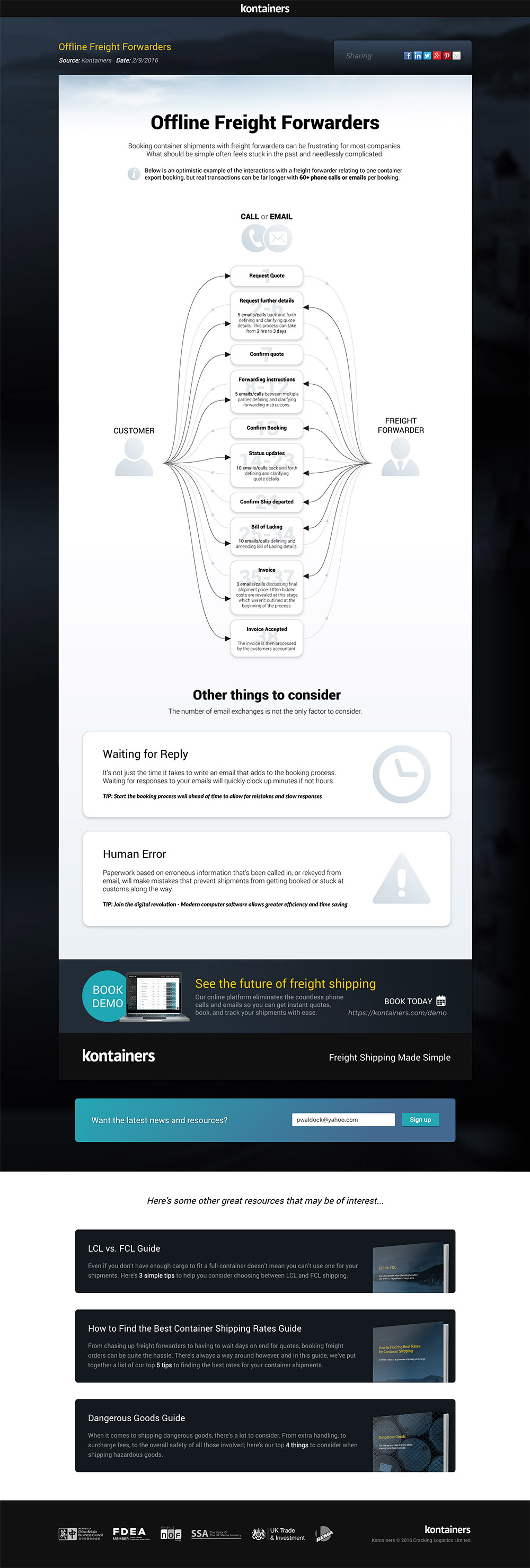
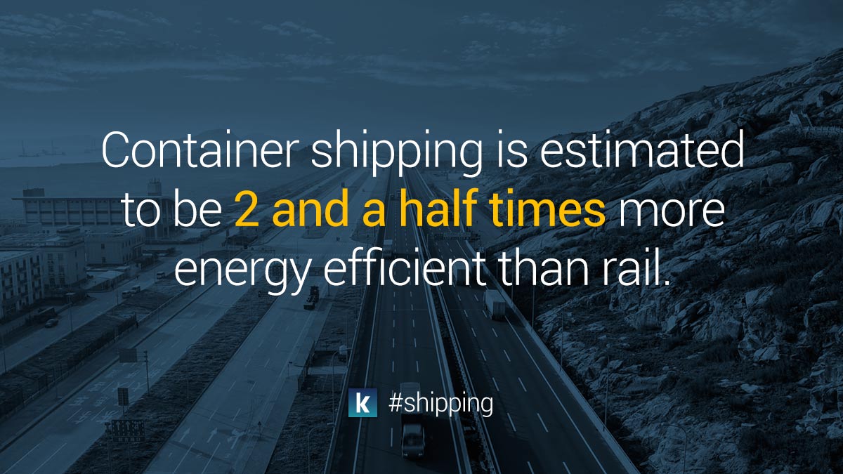
Infographics
The shareability of infographics makes them ideal for social marketing as well ans engaging with existing contacts.
SEO Optimisation Strategy and Delivery
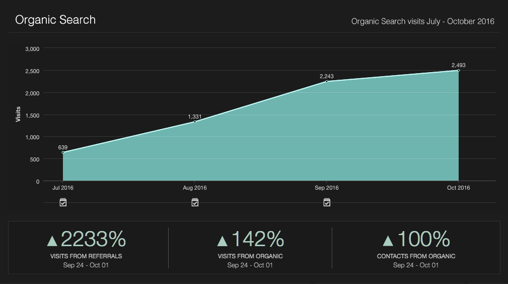
SEO
Over a 3 month period I was able to increase organic traffic by 400% by identifying & targeting keywords, creating targeted content and following best practice optimisation techniques.
Kontainers - Promotional Video
Showcasing the problem space
Early on in the project a short explainer video was created to demonstrate what problem we set at out to solve with the product.